
FLEX布局
2009年,W3C提出了一种新的方案—-Flex布局,可以简便、完整、响应式地实现各种页面布局。目前,它已经得到了所有浏览器的支持,这意味着,现在就能很安全地使用这项功能。
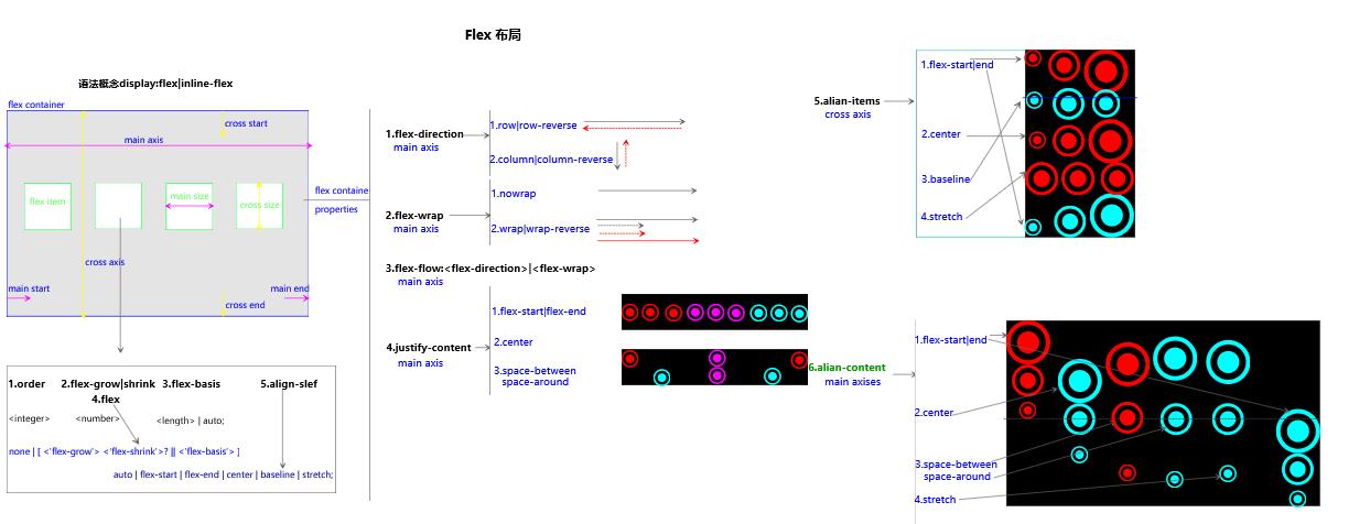
通过笔者大量实践,发现flex布局屡试不爽,尤其在移动端自适应方面。但处于其大量的属性记忆混乱,今天图文并茂梳理如下。
语法及概念部分
实例演示部分
结合笛卡尔坐标系(仅考虑一个item情况,其它情况可以据此的排列组合实现) ![图片描述][2] ##css部分 ``` /*骰子的布局*/ .box { display: flex; width: 50px; height: 50px; border: 1px solid #ccc; border-radius: 2px; } .box .item{ display: inline-block; width: 10px; height: 10px; margin:3px; border-radius: 50%; background: #000; } /*中上(1,0)*/ .c2{ justify-content: center; } /*右上(2,0)*/ .c3{ justify-content: flex-end; } /*左间(0,1)*/ .c4{ align-items: center; } /*左下(0,2)*/ .c5{ align-items: flex-end; } /*中间(1,1)*/ .c6{ justify-content: center; align-items: center; } /*右间(2,1)*/ .c7{ justify-content: flex-end; align-items: center; }
/中下(1,2)/ .c8{ justify-content: center; align-items: flex-end; } /右下(2,2)/ .c9{ justify-content: flex-end; align-items: flex-end; } /两个/ /space-between/ .c21{ justify-content: space-between; } /两个flex-direction+column/ .c22{ justify-content: space-between; flex-direction: column; } /2.3两个space-between+flex-direction+ align-items/ .c23{ justify-content: space-between; flex-direction: column; align-items: center; } /2.4两个space-between+flex-direction+ align-items/ .c24{ justify-content: space-between; flex-direction: column; align-items: flex-end; } /2.5两个space-between+flex-direction+ align-items/
.c25 .item:nth-child(2) { align-self: center; } /2.6两个space-between+flex-direction+ align-items/ .c26{ justify-content: space-between; } .c26 .item:nth-child(2) { align-self: flex-end; }
/3.1三个align-self:center+flex-end/
.c31 .item:nth-child(2) { align-self: center; } .c31 .item:nth-child(3) { align-self: flex-end; } /4.1四个/ .c41 { flex-wrap: wrap; justify-content: flex-end; align-content: space-between; } /4.2四个/ .c42 { flex-wrap: wrap; align-content: space-between; } .column { flex-basis: 100%; display: flex; justify-content: space-between; } /6.1六个/ .c61{ flex-wrap: wrap; } .row{ flex-basis: 100%; display:flex; }
.row:nth-child(2){ justify-content: center; }
.row:nth-child(3){ justify-content: space-between; } /九个/ .c9{ flex-wrap: wrap; }
/网格布局/ /基本/ .Grid { display: flex; }
.Grid-cell { flex: 1; } /百分比布局/ .Grid-cell.u-full { flex: 0 0 100%; }
.Grid-cell.u-1of2 { flex: 0 0 50%; }
.Grid-cell.u-1of3 { flex: 0 0 33.3333%; }
.Grid-cell.u-1of4 { flex: 0 0 25%; }
/圣杯布局圣杯布局(Holy Grail Layout)/ .fh { display: flex; min-height: 98vh; flex-direction: column; margin: 1rem; }
.fh-header { display: flex; flex: 1.2; border: 1px solid #ccc; }
.fh>.fh-middle { flex: 1; border: 1px solid #ccc; margin: 1rem 0; }
.fh>.fh-footer { flex: 2.5; border: 1px solid #ccc; }
.fh-content { flex: 1; border: 1px solid #ccc; }
.fh-nav { /* 边栏的宽度设为20rem */ flex: 0 0 20rem; border: 1px solid #ccc; }
.fh-nav { /* 导航放到最左边 / order: -1; margin-right: 1rem; } /输入框布局*/ .InputAddOn { display: flex; }
.InputAddOn-field { flex: 1; } /悬挂式布局/ .Media { display: flex; align-items: flex-start; }
.Media-figure { margin-right: 1em; } /固定低栏/ .Site { display: flex; min-height: 100vh; flex-direction: column; }
.Site-content { flex: 1; } /流式布局/ .parent { width: 200px; height: 150px; background-color: black; display: flex; flex-flow: row wrap; }
.child { box-sizing: border-box; background-color: white; flex: 0 0 25%; height: 50px; border: 1px solid red; }
### html部分
<!DOCTYPE html>
骰子的布局(左0中1右2,上0间1下2)
1.1一个左上(0,0):justify-content:flex-start(default);
1.2一个中上(1,0):justify-content:center;
1.3一个右上(2,0):justify-content:flex-end;
1.4一个左间(0,1) :align-items: center;
1.5一个左下(0,2):align-items: flex-end;
1.6一个中间(1,1):justify-content: center;align-items:center;
1.7一个右间(2,1):justify-content:flex-end;align-items:center;
1.8一个中下(1,2) :justify-content:center;align-items:flex-end;
1.9一个右下(2,2) justify-content: flex-end; align-items: flex-end;
2.1两个space-between
2.2两个space-between+flex-direction
2.3两个space-between+flex-direction+ align-items
2.4两个space-between+flex-direction+ align-items:flex-end
2.5两个align-self
2.6两个align-self
3.1三个align-self:center+flex-end
4.1四个
4.2四个
6.1六个
9九个
网格布局
2.1基本网格布局
2.2百分比布局
圣杯布局
输入框的布局
悬挂式布局
...
固定低栏
流式布局
```
Leave a Comment